Online Whiteboard
Your Visual Collaboration Tool
Bring your ideas to life and visually collaborate with the online whiteboard
to add more context and implement them faster.
Already have an account? Log in from here
How Online Whiteboard Works
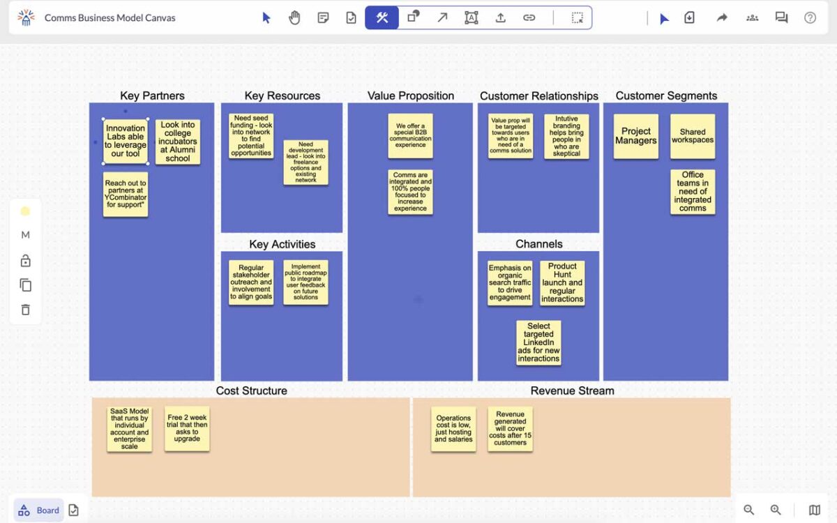
Online whiteboard create visual ideas, pair them with tasks, and effortlessly push them into your existing innovation workflow— your visual collaboration tool


Start Your Online Whiteboard In Seconds
Launch your ideas fast with our online whiteboard,
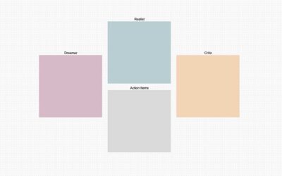
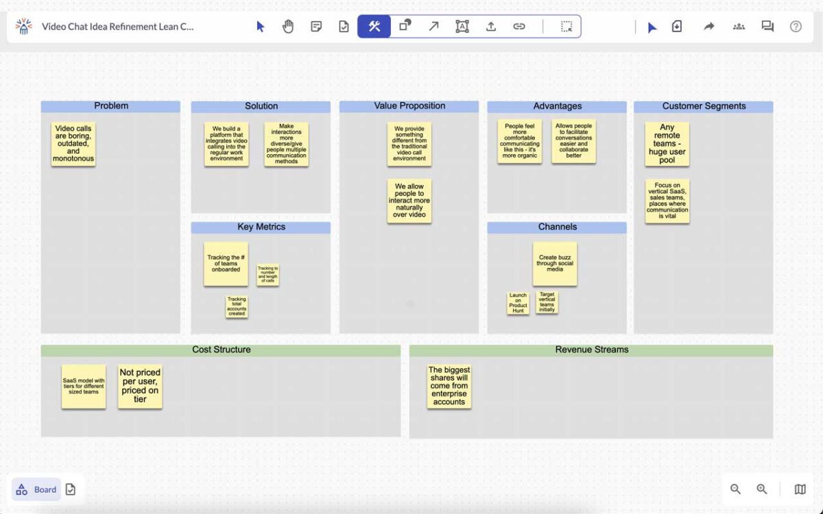
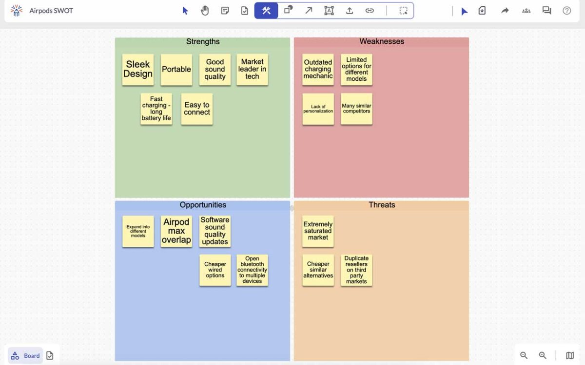
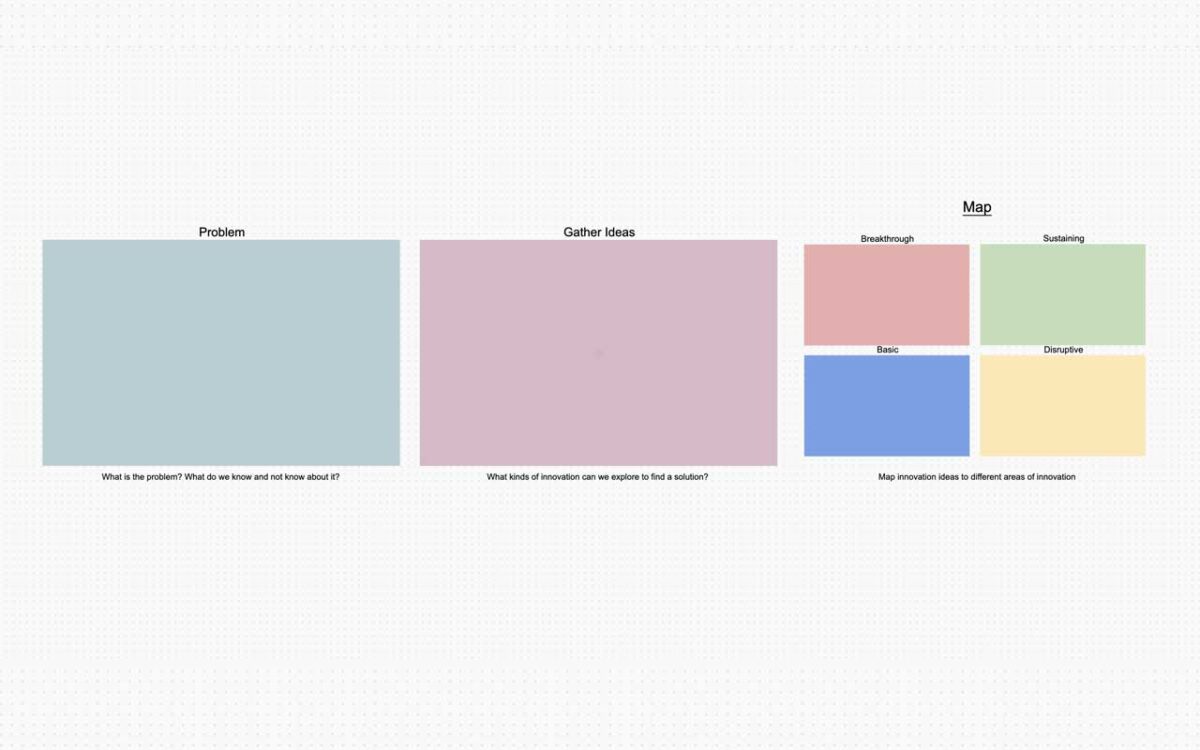
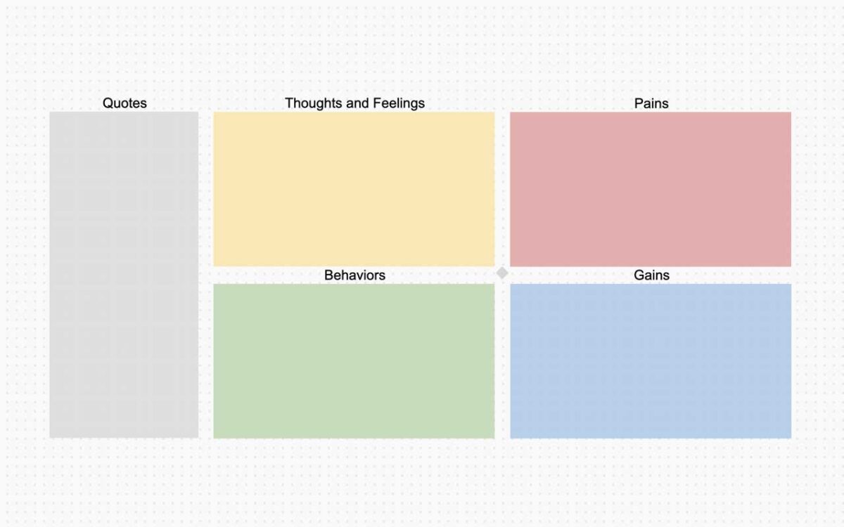
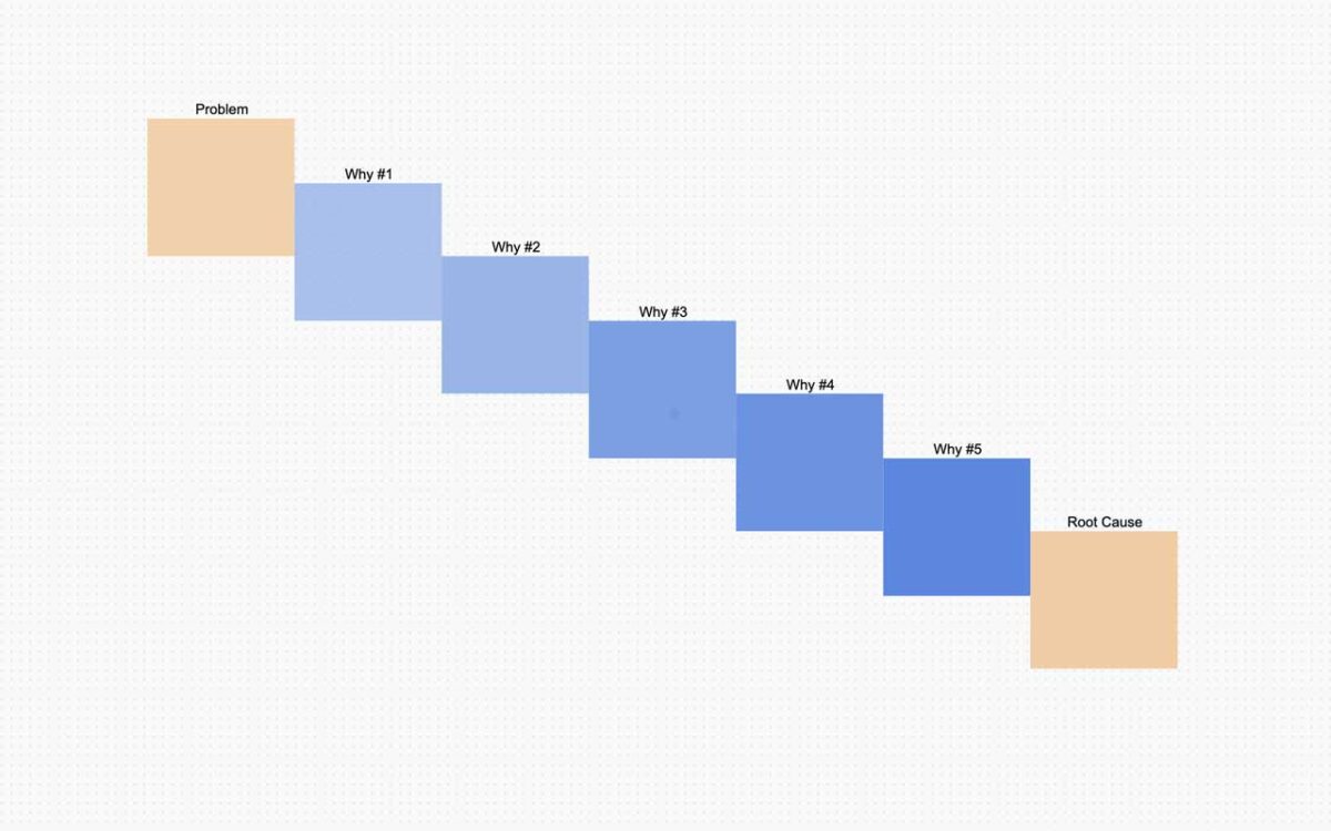
Here are a wide range of innovation templates and building blocks.
Frequently Asked Questions